
Take Your AI's Questions Out of the Terminal
A page in Obsidian has room for what the agent found, a picture, and what could break, so you understand each one before you tick an answer.
This is a decision page. Claude Code wrote it after reading a project's notes, and it shows the detail a chat question leaves out. I answer it in Obsidian.
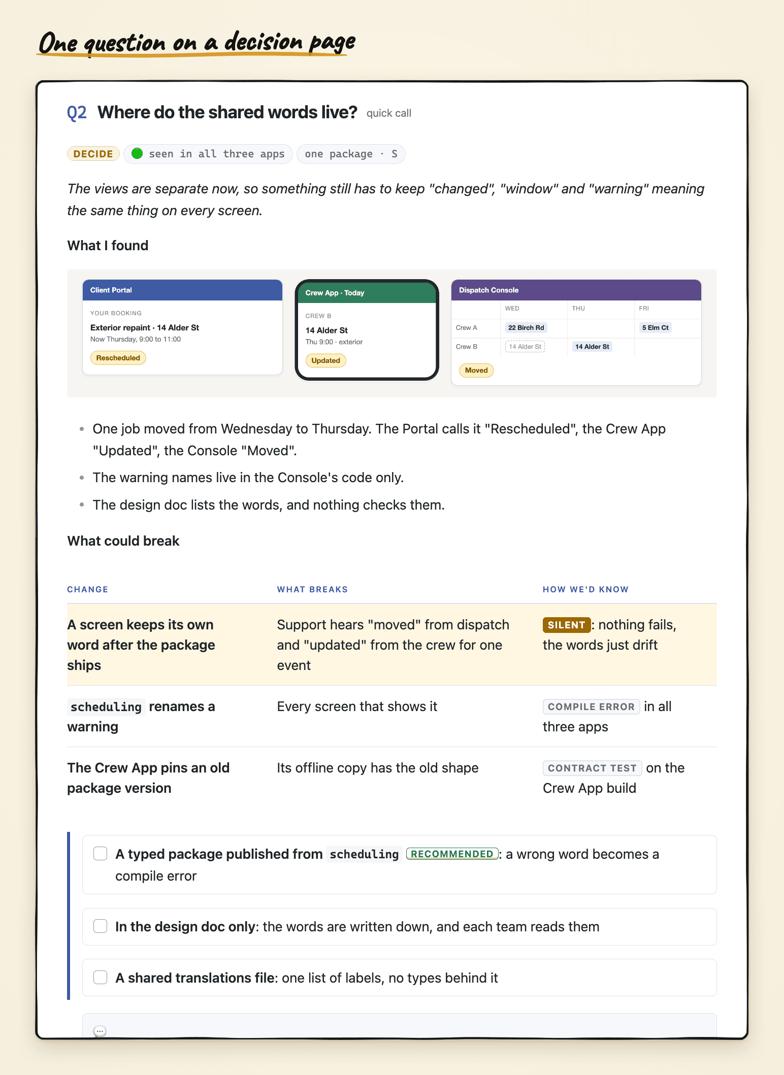
When an AI asks me to choose, what I get is the question and the options, one line each. The detail that would help me choose is still inside its context, and I can't see it. On this page it's all there: what Claude found while reading the project, a picture of the problem, a table of what could break, and only then the options, with one marked as recommended. I tick a box, type a line if I have one, and tell Claude I'm done.
The page is plain markdown. Two things make it look like this: a skill that knows which parts a decision page can use, and the vault stylesheet from Make Your Vault Look and Read the Way You Want, which draws them so I can read the page instead of parsing it. If you haven't set up that stylesheet, start there, because this article builds on it.
How it started
For most choices, the grid Claude Code shows in the chat is all I need. The bigger ones were the problem. One line per option can't hold a picture of the problem or what might break, and once I answer, the question scrolls away, so a month later I can't find what I picked or why.
Matt Pocock's grill-me got me most of the way, and I want to give it proper credit. It's a skill that interviews you about a plan until you and the agent understand it the same way: a round of numbered questions, each with a recommended answer under it. Here's the first round it gave me on the question I use as the example below.
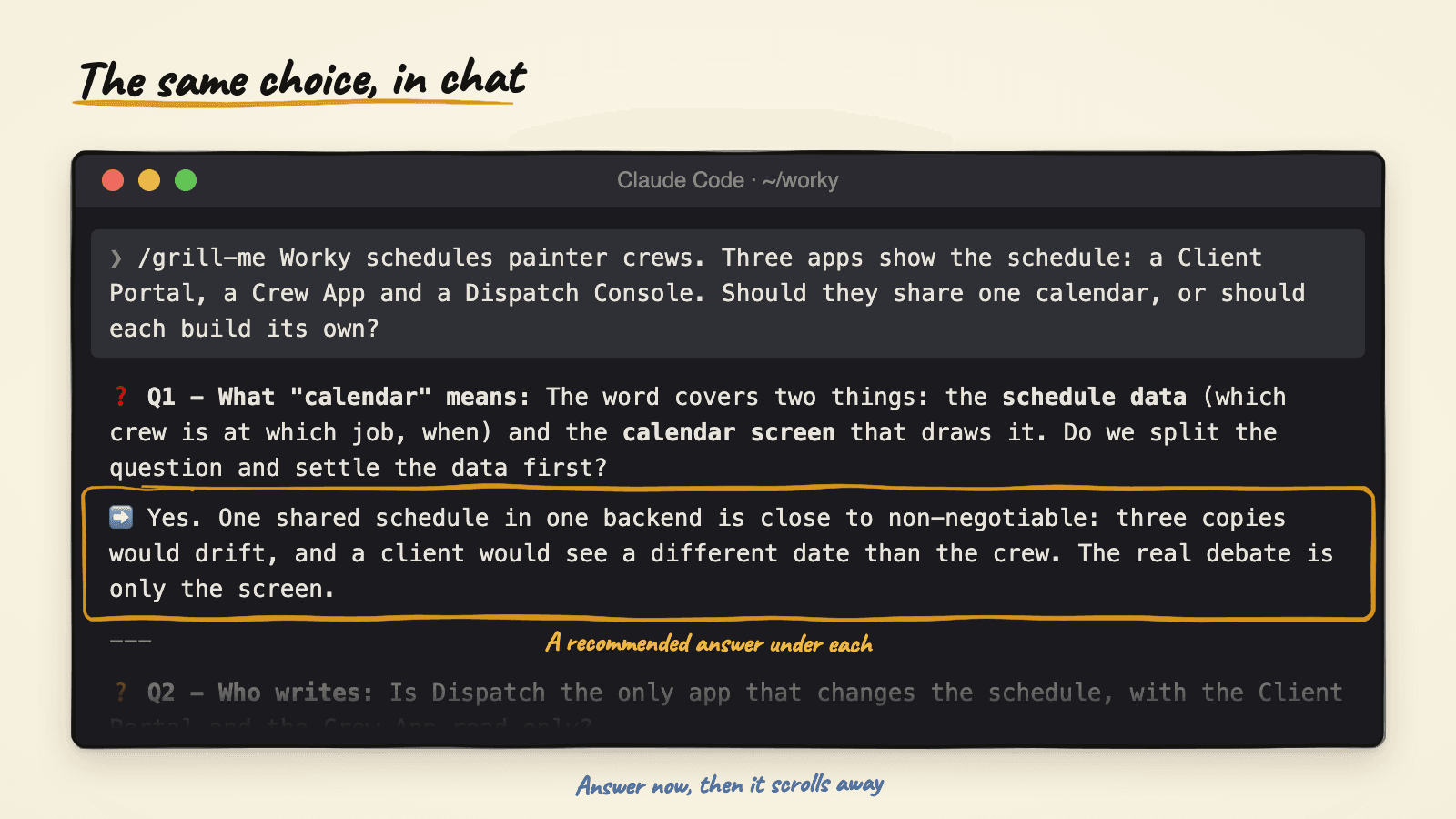
I used it for weeks and kept running out of space, because a terminal gives every question the same few lines, whatever the question needs. So I moved the questions into a document, where a question can carry a picture, a table, or a folded block of code. I ask for a page when the questions need background I haven't read, when there are more than three and they affect each other, or when I've already said "let me think about it". Most choices don't pass that test, and for those the chat grid is still the right shape.
Ask for the page
For the examples I'll use Worky, a made-up company that schedules painter crews. It has three screens: a Client Portal where homeowners book and track a job, a Crew App where painters see today's jobs on a phone, and a Dispatch Console where the office moves crews between jobs. The open question was whether the calendar gets built once and shared, or whether each screen builds its own view of the same schedule.
Here's the kind of thing I said to Claude:
I need to decide whether Worky's three apps share one calendar
or each build their own. Read the Worky notes first, then write
me a decision page I can answer tomorrow. Recommend an answer for
each question, but don't tick anything for me.
Claude read the project notes and wrote one page into the project's decisions folder. Follow-up rounds go into the same page, so there's one place to look.
Put what Claude found beside the question
This is the part a chat round has no room for. Each question on the page carries what Claude found while reading the project, open, right under the heading:
- A row of small tags. One says how sure the finding is, for example "seen in all three apps", and one says how big the change would be.
- A one-line summary of the question.
- A picture, when a picture says it faster.
- A short "What I found" list, two or three plain sentences.
The heading carries a tag too, for how heavy the question is: "quick call", "trade-off" or "the debate". The quick calls come first, so I get a few answers down before the hard one.
This is the second question on the Worky page, about where the shared words live so that "moved" means the same thing on every screen.
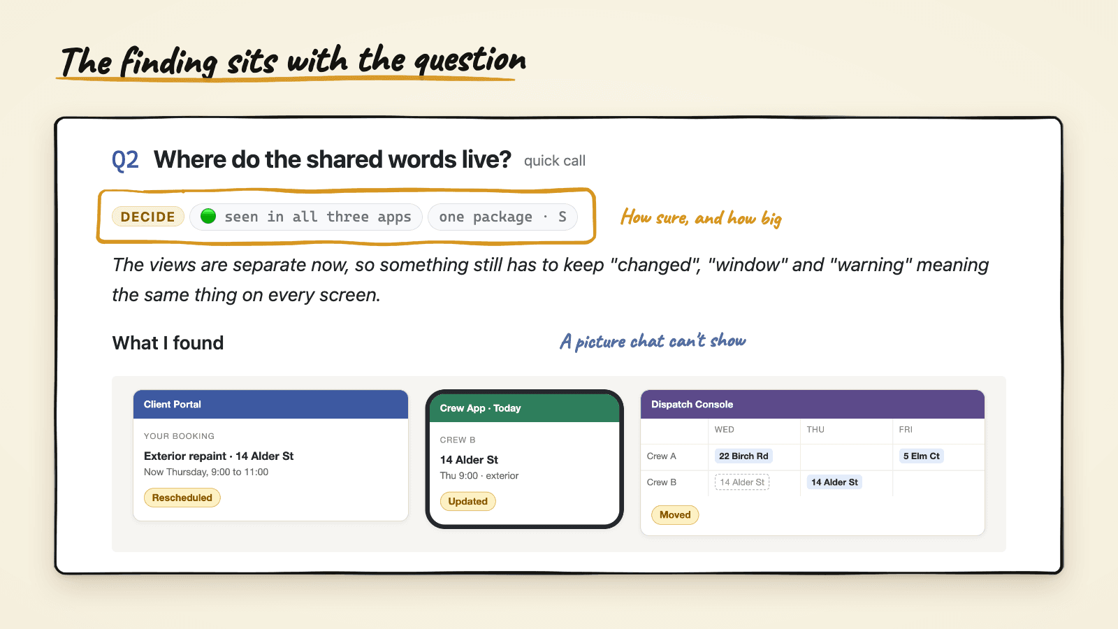
A sentence can say the three screens use three different words. The picture shows it, and a chat round has nowhere to put one.
See what could break before you choose
Under the finding sits a short "what could break" table: the change, what breaks, and how we'd find out. Rows where nothing fails and you only find out late are tinted, so I can spot the dangerous ones without reading every cell.
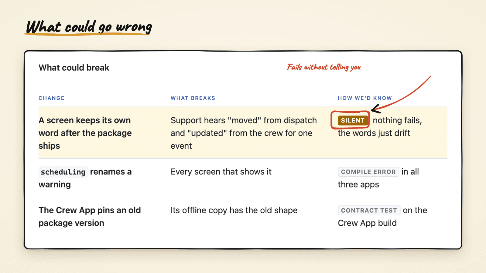
The tinted row is the reason the recommendation is a typed package: with the other two options, a wrong word on one screen fails silently.
Answer right next to the question
Under the table come the options as checkboxes, with a green Recommended tag on one of them, an empty slot to type in, and a folded block called "Dev details".
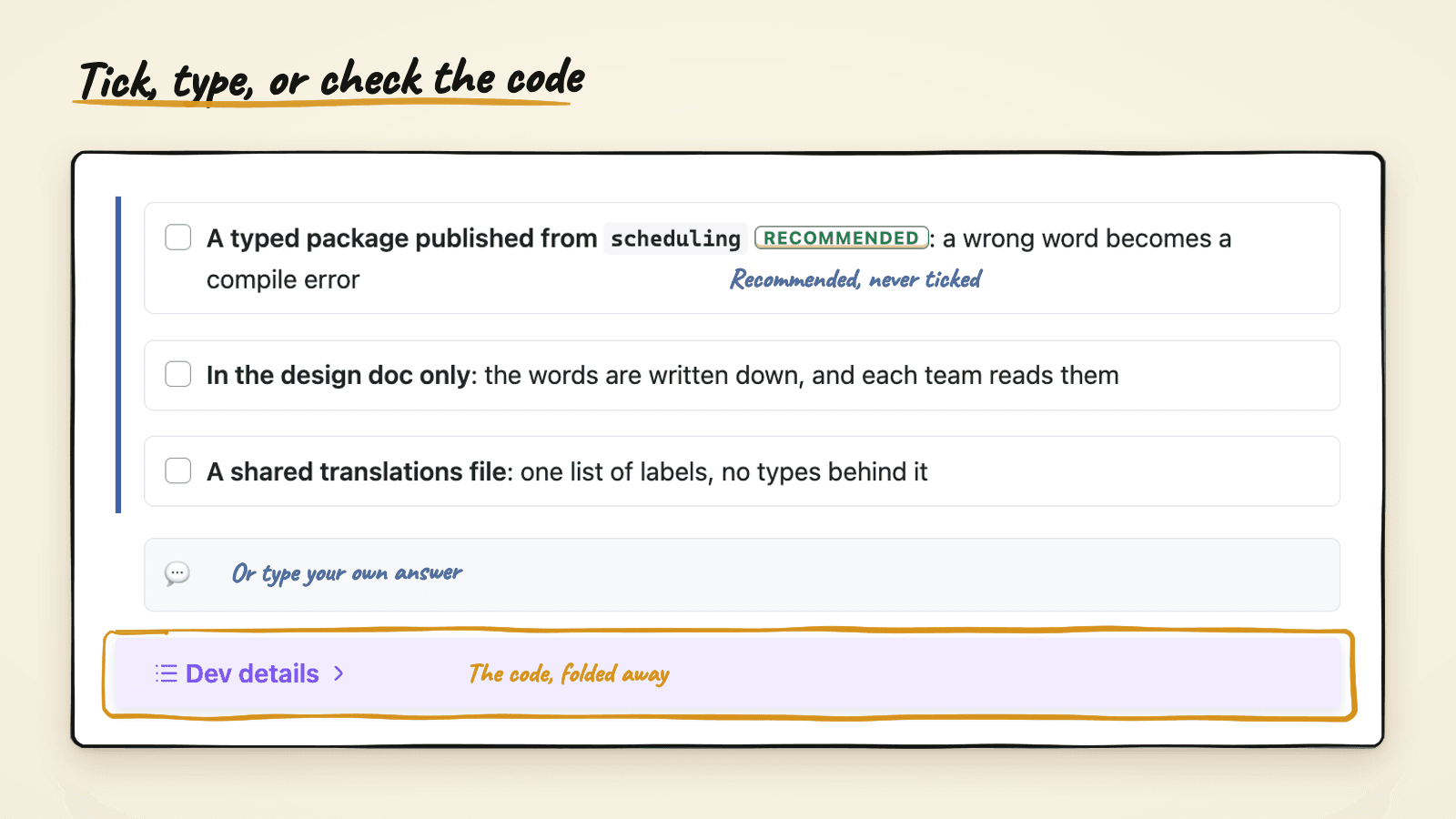
The recommendation is marked but never ticked, because a ticked box should always mean I decided. If Claude ticked it for me, I couldn't tell my agreement from my not reading.
"Dev details" holds the code and the file names: what the package would export, and where each screen keeps its words today. I don't need it to choose, so it stays closed, and whoever wants to check Claude's reading opens it. The rule I ended up with is that what I need to decide is open, and what I'd only need to check is folded.
There's no plugin and no form to export. The page is the form, so my answers stay as text beside the question they answer.
When I say I'm done, Claude reads the page in a set order:
- The "Talk to me" box at the top first, because that's where I'd say it's asking the wrong question.
- The assumptions it listed, to see if I struck one out.
- Which options I ticked.
- Anything I typed beside a question.
- Questions I left blank, which usually means the question was wrong.
Then it tells me what it understood, in one short block, before doing anything. A ticked box with "but only for the Crew App" typed beside it isn't the same answer as a ticked box, and that block is where a misreading gets caught.
The skill that writes it and the styles that draw it
I don't build these pages by hand, and Claude doesn't make them up each time either. Two pieces do the work, and they were built together.
The first is a skill called create-decision. It knows the parts a decision page can use and when to use each one: the tags, the one-line summary, the "What I found" list, the picture, the "what could break" table, the options, the typing slot and the folded "Dev details". Not every question gets every part. A quick call has no table and no picture, and the debate has all of them. The skill writes each part as plain markdown: a short span with a class name for a tag, a normal table for what could break, a checkbox list for the options, a callout that starts folded for the code. It also holds the rules from this article: the finding above the options, the code folded below them, never ticking for you, and the read-back order.
The second is the vault's stylesheet, vault.css, the one from the first article. A few lines in it draw each part: the span becomes a pill, a flag in one table cell tints the whole row, each checkbox becomes a card, and ==Recommended== becomes the green tag. The decision page is the same stylesheet put to work on one kind of note.
Here are the parts in one picture.
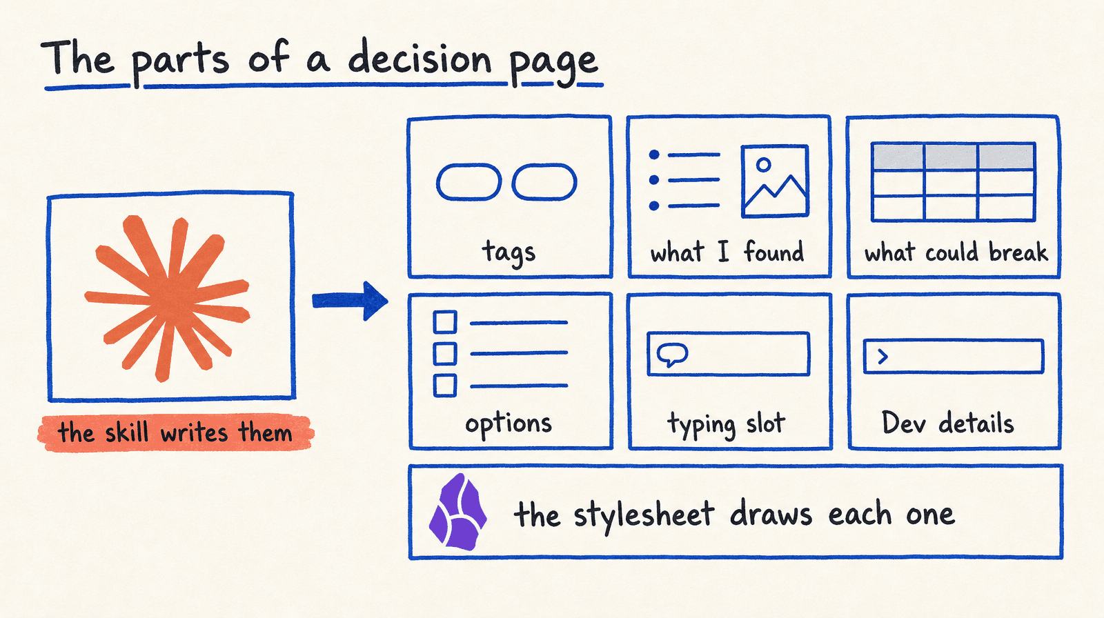
The two pieces know about each other through the obsidian skill from that first article. It lists the components the vault can draw, with the markdown for each one. create-decision picks from that list, so when I added the tinted row, I added it in both places: one rule in vault.css, one line in the component list, and the decision skill could use it the next time.
That split is why the page survives outside Obsidian. Open it in any editor and the questions, the options and my answers are all still there as text. Only the cards and the colors are gone.
The parts are the ones I wanted. If you don't want the tags, or you want the code open, or you'd rather have a "what we tried before" list than a table, you say that to Claude and it changes the skill, so every page after that has the parts you chose.
Both pieces are in the obsidian-claude-vault repo: the skill under .claude/skills/create-decision, the styles in .obsidian/snippets/vault.css, and the Worky page at Projects/Worky/decisions/One calendar or three.md.
Watch answered questions fold into phases
Once I answer a question, it becomes a numbered decision, and the decision moves into the phase of work it led to. Here's the whole loop.
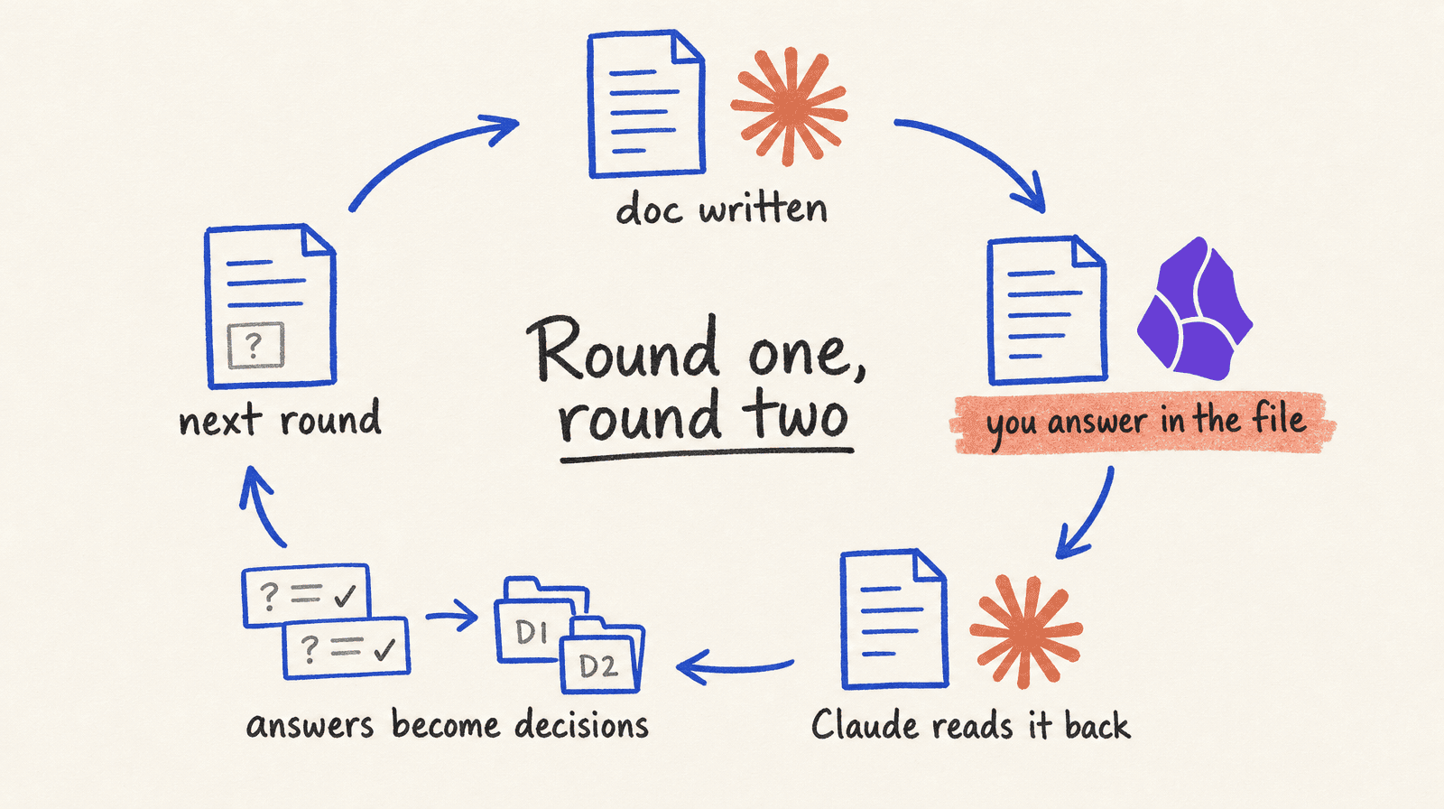
On the Worky page I answered the first question in round one: three views over one schedule. That's now D1. It sits inside the phase that's in progress, folded, with my reason, the options I didn't pick, and what would make me reopen it.
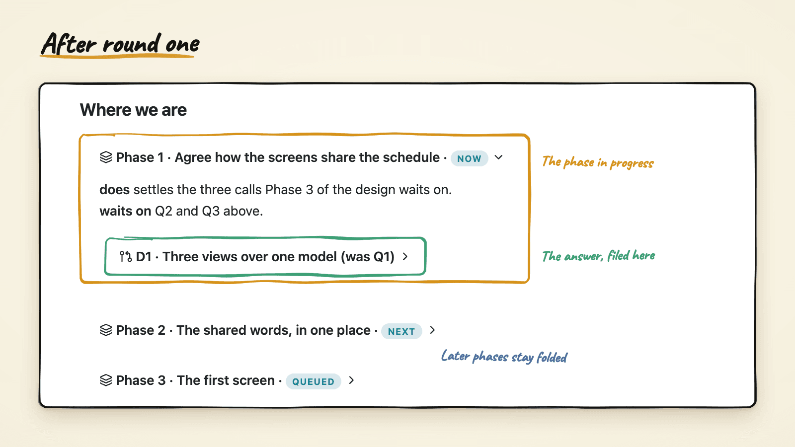
As the project moves, finished phases collapse to a single line with a colored status. The page gets shorter as more gets decided. What's left open is at the top, and the history is one click away, filed under the work it produced instead of the order I was asked. The numbers never get reused, because people say "D1" long after the round that made it.
My first version let these pages expire after a few weeks. I changed my mind, because the answered page turned out to be the most useful note in the project folder. When something changes, I open the decision, read the "revisit if" line, and decide again with the old reasoning in front of me. And before Claude writes a new decision page, it reads the project's decisions folder, so it doesn't ask me something I already settled.
Try it, then make your own
Pick a decision you've been putting off, the kind where you've said "let me think about it" at least once. Ask Claude to read the notes around it and write you a decision page with a recommendation for each question, then answer it tomorrow with coffee. If you want a working example first, clone obsidian-claude-vault and open the Worky calendar decision. One call is already filed in its phase, and two questions are waiting for you.
Decisions are only my example. The same two pieces work for any page you answer or read often: a skill that knows which parts the page can use, and a few styles that draw them. It could be a weekly review you tick through, or a bug list with a tag on each item saying how sure the finding is. Tell Claude what you want to see when you open the page and how you want to answer it, then ask it to write the skill and the styles. Mine took a few rounds of "this part looks off" before it settled, and yours will too.


