


In this article, we will go through some tips for setting up and optimizing StoryBook for Angular applications that go from things that only make sense for Angular, like adding a shared module, to more non-framework-specific things, like adding useful add-ons.
Add a folder for other documentation
StoryBook comes with a set of example stories, but I prefer them to be in a different location to make them easy to find and keep them contained in the StoryBook folder.
I recommend you start by creating a new folder in the main StoryBook folder, and in here I add all the documentation files (.mdx) that help explain the component library, coding guidelines, or any other useful links for the team.
Create the folder in
./.storybook/storiesModify the
main.tsto look for documentation files in that folder and any of its sub-folders:
stories: [

   "../stories/**/*.mdx",
],
3. Try it out by adding documentation files
<!-- ./.storybook/stories/introduction.mdx  -->

import { Meta } from "@storybook/addon-docs";

<Meta title="Introduction" />

# Introduction
... Here goes an explanation of the site
The StoryBook from Fluent UI is a perfect example of how you can use these documentation files to enrich your component library. Here you can see a short video of how it looks:
Setup your application providers
You can save setup time in your stories by adding the most common components, icons, localization, state management, and any kind of setup—to the preview file from StoryBook.
// 📃 .storybook/preview.ts
const preview = {
  decorators: [
    applicationConfig({
      providers: [
        provideAnimations(),
        provideHttpClient(),
        {
         provide: APP_BASE_HREF,
         useValue: window.location.pathname.substr(0, window.location.pathname.lastIndexOf('/'))
        }
        provideTransloco({
              config: {
                  availableLangs: ['en', 'es'],
                  defaultLang: 'en',
                  reRenderOnLangChange: true,
                  prodMode:false,
              },
              loader: TranslocoHttpLoader
          }),
      ],
    }),
  ],
};
Speed-up Compodoc
In Angular, StoryBook uses Compodoc to generate the documentation that will be displayed in the stories and controls.
Sometimes the generation becomes slow, and it is even more noticeable if you are constantly re-doing the documentation or if you are in the middle of improving the documentation in your components and you want to see how it is looking.
Well, to make it run faster, you can set the following settings:
// 📃 angular.json
{
  ...
  "storybook": {
    "builder": "@storybook/angular:start-storybook",
    "options": {
      "configDir": ".storybook",
      "browserTarget": "limble:build",
      "compodoc": true,
      "compodocArgs": [
        "-e",
        "json",
        "-d",
        ".",
        // 👇 Add these settingss
        "--minimal",
        "--disablePrivate",
        "--disableInternal",
        "--disableSourceCode",
        "--disableLifeCycleHooks"
      ],
      "styles": [
        "projects/lim-ui-docs/src/styles.scss"
      ],
      "port": 6006
    }
  },
}
Set up a theme
There is an amazing guide at StoryBook, but I will show you the quick things I do to setup a theme
The first thing is to add a logo, and to do this, we will need to create a folder for images and add it to it .storybook/assets/images/logo.png
Now that you have added the logo, you can configure StoryBook to load it as a static asset:
// 📃 .storybook/main.ts

import type { StorybookConfig } from "@storybook/angular";

const config: StorybookConfig = {
   stories: [
       ....
   ],

   staticDirs: ["./assets/images"],
}
Next, create a theme file to at least set the name, logo, and primary and secondary colors:
// 📃 .storybook/theme.ts
import { create } from '@storybook/theming/create';

export default create({
  base: 'light',
  brandTitle: 'My custom theme for StoryBook',
  brandUrl: 'https://example.com',
  brandImage: 'logo.png',
  brandTarget: '_self',

  colorPrimary: "#5083d5",
  colorSecondary: "#289e49",
});
Finally, load the theme in the manager.ts file
// 📃 .storybook/manager.ts
import { addons } from "@storybook/manager-api";
import yourTheme from "./theme";

addons.setConfig({
   theme: yourTheme
});
Stories Layout and Autodocs
Now, moving on to how the stories are presented, there are two easy settings that I like to use.
The first one is centering all the stories to make it easy to identify alignment in big components. To enable this, you only need to set the layout:centered parameter in the preview file.
// 📃 .storybook/preview.ts
const preview: Preview = {
   parameters: {
      actions: { argTypesRegex: "^on[A-Z].*" },
      controls: {
         matchers: {
            color: /(background|color)$/i,
            date: /Date$/i
         }
      },
      layout: "centered"
   }
};
Here is a preview of how your stories will look after setting them up:

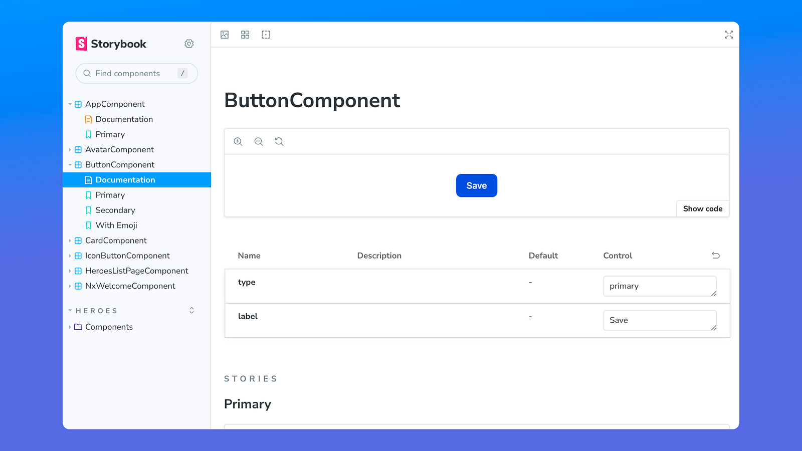
The other easy win is to setup auto docs to be generated for all stories. This will create a new documentation file on top of all the stories that can serve as the starting point for the component since it has the interface and all the stories related to it in a single place.
// 📃 .storybook/main.ts
import type { StorybookConfig } from "@storybook/angular";

const config: StorybookConfig = {
   ...
   framework: {
      name: "@storybook/angular",
      options: {}
   },
   docs: {
      // 👇 Set up the auto docs feature
      autodocs: true
   }
};
export default config;
Here is an example of how this will look:
Setup your supported viewports
Usually your application will be able to run with multiple viewports and in the best cases, you will be developing a fully responsive website and StoryBook provides a way to see how your components behave using different viewports.
By default, StoryBook comes with some viewports, but I prefer to configure custom viewports that I know the application is supported in, since some times they are not fully responsive.
Here is how you can set up some viewports:
// 📃 .storybook/preview.ts

// 👇 Create the viewports used by your application
const customViewports = {
   large: {
      name: "Large Screen",
      styles: {
         width: "1920px",
         height: "1080px"
      }
   },
   small: {
      name: "Small Screen",
      styles: {
         width: "800px",
         height: "963px"
      }
   }
};

const preview: Preview = {
   parameters: {
      ...
      // 👇 Create the viewports used by your application
      viewport: { viewports: customViewports }
   }
};

export default preview;
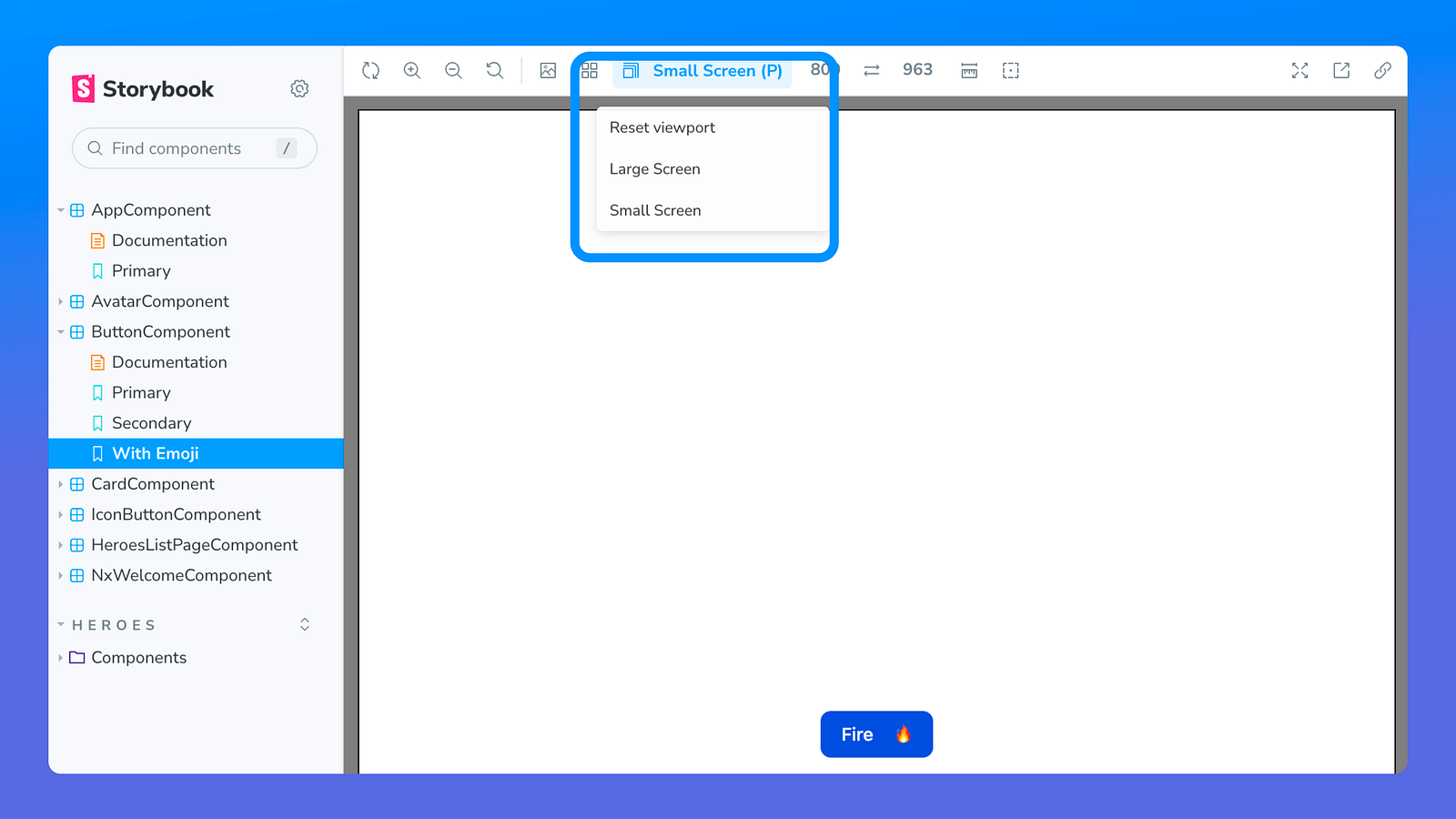
Here is how the viewport options will be shown in StoryBook:
Other Addons
StoryBook comes with the essential add-ons, and usually that should be enough to get started with it, but lately I have been using the add-ons for accessibility and story source, and they have become a part of my setup.
Accessibility
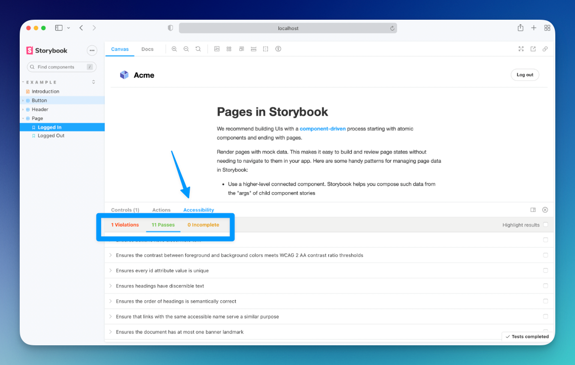
The accessibility add-on will add a new tab to your stories that will show you how accessible your components are and what needs to be fixed.
Story Source
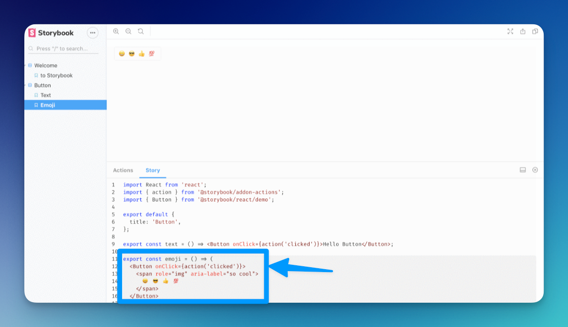
The Story Source add-on will show how was the story created, and this is helpful if you are in the middle of development and you want to use a component but you don’t remember how to set a specific state.
To install them, use the following command:
yarn add @storybook/addon-a11y @storybook/addon-storysource --dev
Add this line to yourmain.ts file (create this file inside your Storybook config directory if needed).
// 📃 .storybook/main.ts
import type { StorybookConfig } from "@storybook/angular";

const config: StorybookConfig = {
   addons: [
      ...

      "@storybook/addon-a11y",
      "@storybook/addon-storysource"
   ],
};
For more articles and tips for better DevX and CX with Angular and Web Development, you can find me at: