The problem
You want to see what the app looks like for a user in Japan, on the premium tier, with the new checkout flag on, when the payments API is down.
Getting there is a twenty-minute errand. Ask someone to flip a flag in a dashboard. Wait for it to propagate. Change your locale. Find a test account on the right plan. Get the backend to return a 500 on demand — which usually means someone commenting out a line in a shared environment.
Every one of those steps is a dependency on someone or something else. So mostly, people don't check. Bugs in the states nobody looked at ship, because looking was expensive.
The framing I settled on: an engineer switches between writing code and exercising the app many times an hour. Every one of those switches should cost nothing. Zero context switches between "I want this state" and "I have this state."
Why I built it
The states were all already in the browser. The flag is a boolean the client reads. The locale is a client setting. The API response is something the client receives. Nothing about inspecting these states requires a backend round-trip — we'd just built the tooling as if it did.
So: put the controls in the app, next to the thing you're looking at.
The name I rejected first was "debug panel", and it's worth saying why. A debug panel is something you open when something is broken. This is meant to be open while you build, the way DevTools is always open. That reframing changed what went into it — not diagnostics, but controls.
I was also specific about what it must not look like. No SaaS-dashboard metric tiles. No browser-DevTools grey chrome. No neon-on-black AI aesthetic. No Material defaults. A tool that lives inside someone else's app should have a point of view but not a costume.
How it works
A drop-in Angular library. Add it to the app shell, get a toolbar with a tool per concern: feature flags, permissions, app features, i18n, presets, network mocking. Six tools, eleven exported components, Ctrl+Shift+D to open.
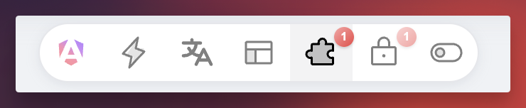
The whole surface area. It floats over the running app, and a badge shows which tools have something overridden right now.
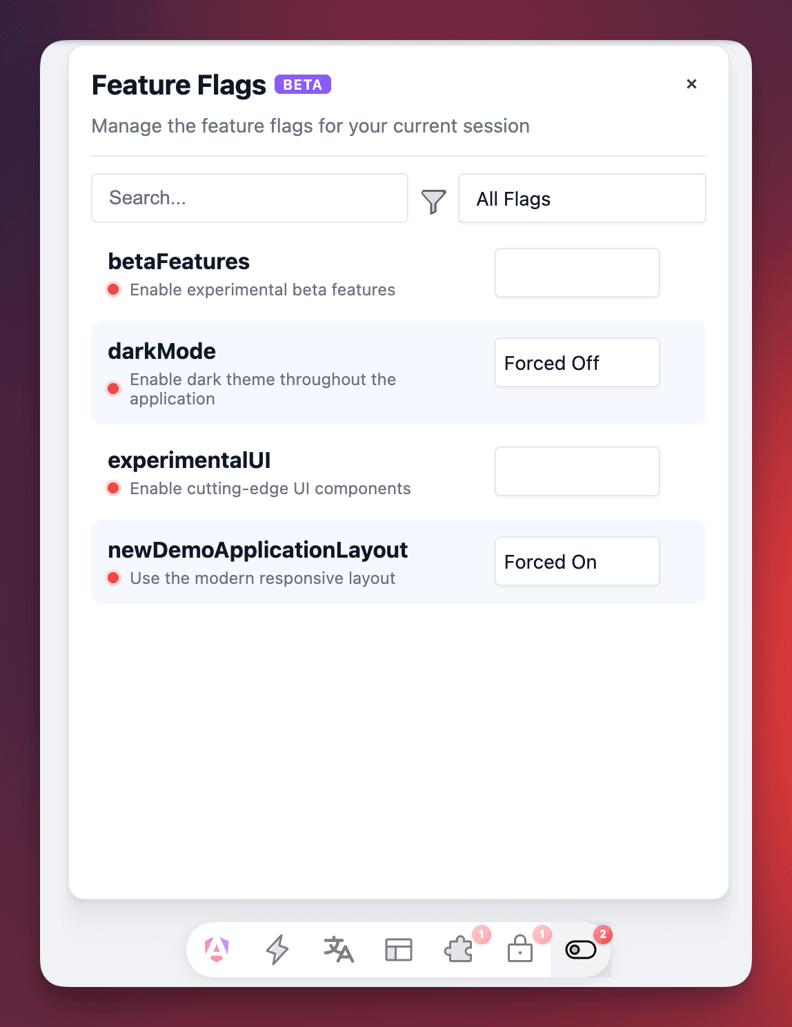
One tool open. Flags are forced per session, so a state that used to need a backend change is two clicks and survives a reload.
Three decisions did the heavy lifting.
Defensive CSS is non-negotiable. This is the constraint that shapes the whole codebase, and I learned it the hard way. The demo app is not representative of the real world. This toolbar lands inside apps with Tailwind, Bootstrap, Normalize — resets that will happily eat your margins and collapse your layout. So: explicit spacing everywhere, never a browser default. contain: layout style on overlays to wall them off. flex-shrink: 0 on chrome, min-height: 0 on scroll areas. It reads like paranoia until the first bug report from someone whose CSS reset ate the toolbar's padding — and then it reads like the only sane way to ship a library that renders inside code you've never seen.
Zero production cost. The toolbar is dynamically imported, so it never lands in a production bundle. A dev tool that ships to users is a liability, and "remember to remove it" is not a strategy.
An open peer range you can actually verify. The package declares >=19.0.0 for Angular, which is a promise. Promises need backing, so every release is AOT-compiled against Angular 19, 20, 21, and 22 in CI, each in its own sandbox app. An open peer range you don't test is just a promise you haven't broken yet.
Results
- ~3,300 npm downloads a month, 42 stars.
- 206 commits since December 2024 — the oldest project here by a year.
- 409 tests; verified against four Angular majors on every release.
- Six tools, 30+ icons, ~17,000 lines. MIT licensed.
What I'd do differently
I burned a whole major version on a two-character typo. Version 4.0.0's headline breaking change was renaming the ngt- prefix to ndt- — across every component selector and every CSS custom property. That's it. That's the major. An inconsistent prefix crept in early, I didn't fix it while it was cheap, and by the time it mattered it was in every consumer's stylesheets. Naming is not a detail you get to defer; it's the one decision that hardens fastest.
The product's name and the package's name still disagree. It's published as ngx-dev-toolbar and presented as "Angular Toolbar". Renaming the package would break every install, so it stands — a permanent, visible reminder to pick the name before the users arrive.
I migrated the test framework mid-flight (Vitest to Jest), which cost real days and delivered nothing a user can see. Sometimes that's necessary. It's worth being clear-eyed that it is a tax, not a feature, and I'd want a sharper reason next time than "this one is better."